Other than consistently creating highly engaging content, having a visually differentiated Instagram grid is the most effective way to convert a larger percentage of profile visitors into followers.
When we discover an Instagram account, the first thing we do is quickly scroll through it while subconsciously evaluating their bio, their number of followers, and how the grid looks. It’s a process that takes three to five seconds, and it goes something like this:
If the account offers the type of content that interests us, in a way we find interesting and/or valuable, we follow it. If it doesn’t, we don’t.
The process is quick and simple, and since most Instagram users (us) don’t take the time to thoroughly read through an account’s content, we mainly evaluate of whether we find it interesting or valuable enough to follow exclusively by how the account’s grid looks when we scroll through it.
Having a carefully crafted Instagram grid won’t get more people to discover your page. But it will increase the percentage of people discovering you who are converted into new followers, in comparison to a page that offers something similar but doesn’t make the effort to craft a differentiated Instagram grid. Over a long enough time, that slight increase in conversion can turn into thousands of new followers. In an increasingly competitive Instagram landscape, that matters.
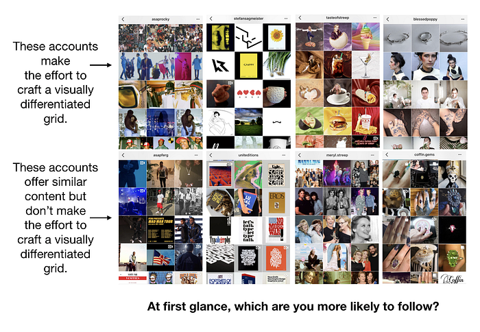
How To Create a Visually Differentiated Instagram Grid
The process of creating a visually differentiated Instagram grid can be broken into two main strategies.
1. Multiples of three pattern
Crafting a differentiated grid through consistently posting in a pattern of multiples of three works as follows:
Instagram always shows us an account’s posts in stacked rows of three photos. This is called an account’s grid.
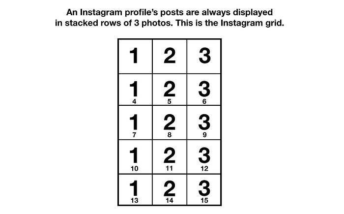
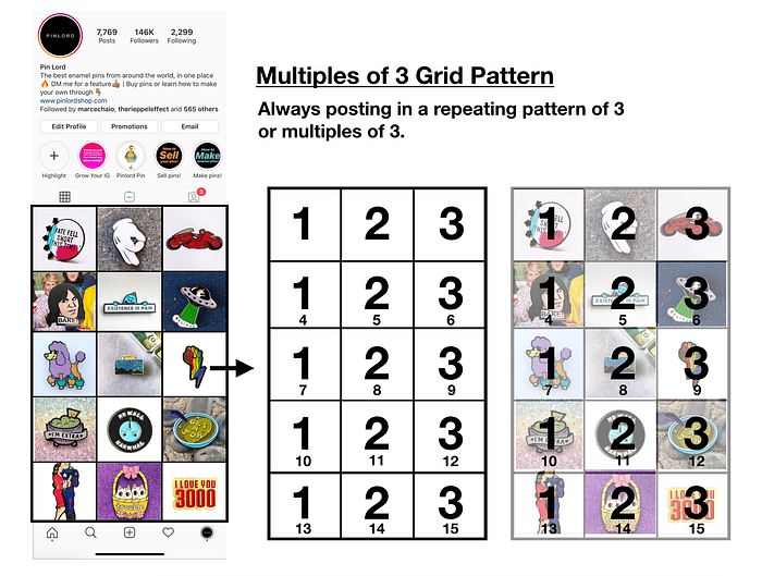
Because Instagram displays an account’s content this way, you can post in a repeating order of three or multiples of three (six, nine, twelve, etc), and it’ll always look like there’s an overarching pattern throughout your grid.
For example, I achieve a distinctive grid on my account, @pinlord, by employing a simple pattern of six based on switching between a white and a colored background. It goes like this:
- Pin with a white background
- Pin with a colored background
- Pin with a white background
- Pin with a colored background
- Pin with a white background
- Pin with a colored background
Repeat. As long as every other post has a white background, it doesn’t really matter what color the post in between is because it’s the white that creates uniformity.
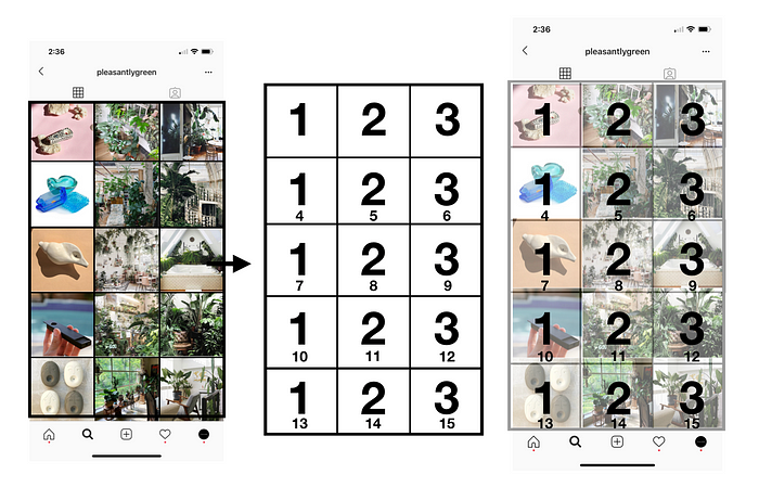
An even more simple take on this pattern is repeatedly posting a particular type of photo every third post. For example, in @pleasantlygreen, I created a visually differentiated grid by posting a photo of a cannabis accessory every third post. The other two posts were indoor-plant-related photos. It goes like this:
- Photo of a cannabis accessory
- Photo of indoor plants
- Photo of indoor plants
Repeat. This is how it looked:
Although it’s much less obvious, and therefore much less effective at converting new followers, as long as every third post is a photo of my wife, it doesn’t really matter what I post in between because it’s these photos that create uniformity. Here’s how it looks:

You could accomplish something similar by always posting a photo of someone’s face every third post, or a quote every third post, or whatever other types of content are visually cohesive and you can consistently repeat. You could also continue with a wide number of variations of what a grid could look like as long as you continually post the same pattern in a multiple of three.
As long as you don’t deviate from the pattern, it’ll look like a well-thought-out grid.
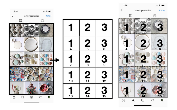
Another widely used but rarely perfected take on the Multiples Of Three strategy is always posting visually related imagery in groupings of three. Meaning, you post three photos or videos that tell a visual story or are at least visually related back-to-back-to-back. After a grouping of three, you post another grouping of three that tells a different distinct visual story. As long as you always post visually related groups of three, each row of your grid will look unique as well as build into an overall cohesive and differentiated grid.
For example, the ceramics curator account @noticingceramics posts three similar-looking photos in a row featuring ceramicists who share visual similarities in their work. This creates a cohesive grid because it looks like every row was crafted thoughtfully, and it’s visually pleasing for the eye. Here’s how it looks:
Another example is indie jewelry brand @blessedpoppy. They create a grid that differentiates them from most jewelry brands on Instagram by making the effort to showcase each of their designs through a story of three posts in a row. This is how it looks:
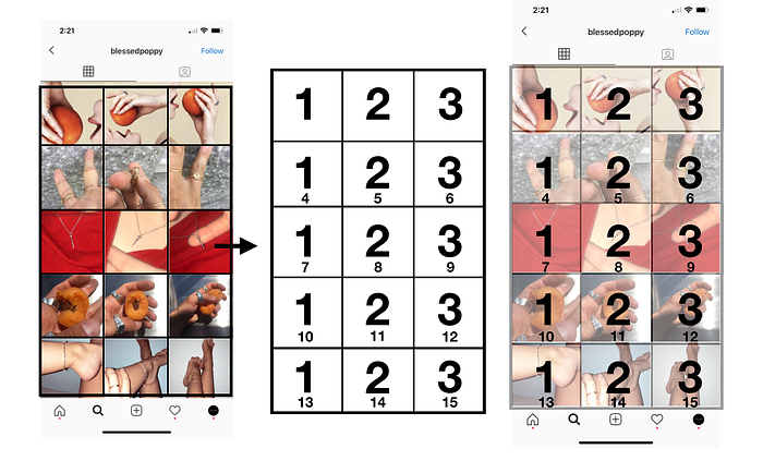
Although visually unique, @blessedpoppy’s grid also showcases a problem that a lot of accounts fall into when trying to execute this “three post story” look. If you prioritize making sure that all three posts look similar and forget to give each post its own unique value when viewed on the home feed, this strategy can lead to diminished engagement rates.
All posts, regardless of your grid pattern, should have an intrinsic reason to be on the feed. They should have their own story and create value to your audience by themselves. If not, your audience will stop engaging with your posts (because the images will have no value when seen on the home feed), and you’ll lose any value you would gain by having a differentiated grid. Bottom line is, having engaging posts is always more important than a good grid layout.
This is why you should never use Instagram photo splitting apps that help you cut a photo into sections that, when posted, create a larger photo on your grid.
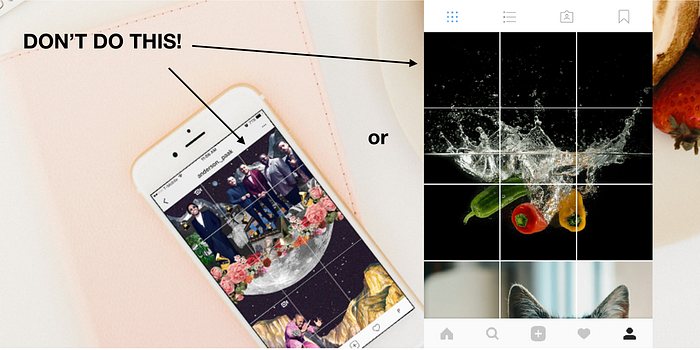
Sure, you’ll have a distinct grid, but none of the individual photos will get engagement (which means that your account won’t be valuable) because the only thing your audience will see is a small portion of a larger photo that makes no sense and has no value on their home feed (plus, is usually blurry due to the photo size). Don’t use photo splitting apps!
OK, now that you know how this strategy works, how to execute it, and what not to do, remember the key to executing this strategy effectively: consistency.
For any of these Multiples of Three grid patterns, the most important element to maintain them is to repeat the pattern you chose consistently, without changing or stopping it, unless it makes the grid look better when people scroll through it. Otherwise, there will be no perceived visual uniqueness when people first scroll through your grid, and you won’t generate a larger percentage of Follows from the people who discover your page.
2. Color scheme coordination
The second main strategy you can follow to differentiate your grid is a Color Scheme Coordination strategy.
In comparison to the Multiples of Three Pattern strategy, which cares about the pattern in which you post, the Color Scheme Coordination only cares about making sure that each photo you post has a degree of color coordination with all other posts on your account.
For example, lifestyle blogger @thatgemruby executes this strategy by only posting photos and videos that share tones of peach, pink, and white. @theminimalistmodel also employs this strategy by only posting photos and videos that share shades of green and blue. This is how those account’s grids look:

By following this strategy, @thatgemruby and @theminimalistmodel are much more likely to grow at a faster pace vs. other accounts that create similar content but don’t make the effort to visually direct their grid.
A slightly more complex and less replicable variation is a Transitioning Color Scheme Coordination. In this variation, you post groupings of content that share a degree of color coordination, and you transition the colors over time.
For example, the super-creative makeup artist @visiblejune creates a varying color grid scheme by posting images of her looks with colored backgrounds that seamlessly transition from white to green to blue, etc. The kawaii plush doll company @squishables does something similar by transitioning the main color of their posts over time from blue to pink to purple to yellow to orange. Here’s how those transition sections of their grids look:

Again, these Instagram accounts are creating similar content to many other accounts, but by paying extra care about how their grids look, they differentiate themselves and therefore grow faster.
The key to executing this strategy effectively: In comparison to the Multiples of Three Pattern strategy, this is much harder to consistently execute unless you already have the content creation skills needed to pull it off. If you struggle to make this type of visually excellent photography or video, the best option is to hire or collaborate with someone who feels comfortable in both photography and grid coordination.
It is precisely because it’s much harder to execute that this strategy is harder to replicate. This leads to potentially growing at a faster rate and for longer, in comparison to similar accounts that lack the content creation skills to differentiate themselves similarly.
Merging both strategies
Although much harder to execute, merging both the Multiples of Three and the Color Scheme Coordination strategies can result in a highly differentiated grid that is very hard to replicate and very effective at converting followers.
You do it by posting a repeating order of three or multiples of three while making sure that each photo you post is color-coordinated with all other posts on your account. A great example of an Instagram account that merges both strategies is by model/YouTuber @kickiyangz. She achieves this by following a pattern of:
- A photo of herself
- A photo of a closeup on a makeup look
- Another photo of herself while transitioning colors in every single row
Repeat. This is how it looks:

By crafting such a unique and visually striking grid, she’s setting herself apart from all other content creators who do something similar to her on Instagram (there are MANY of them), growing faster, and most likely earning more money.
Tools That’ll Make It Easier for You
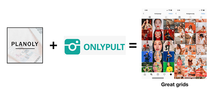
Apart from having a good camera and knowing how to use it to create awesome photography, the hardest part about executing this strategy is being able to know which photos to post and when to post them to stick to your strategy. To solve this problem, I use a grid visual planner like Planolyor UNUM to plan my grid visuals ahead of time, as well as a browser-based Instagram content poster like Onlypult to automate the process of posting the content in the right order.
That’s it! That’s all you need to know to create a visually differentiated Instagram grid layout.
In Summary
Don’t forget! The two main strategies of how you can differentiate your grid are very simple. You consistently post in a pattern of multiples of three, or you make sure that each photo you post has a degree of color coordination with all other posts on your account, or you do a mix of both. All you have to do is create great visual content (or hire someone to do it) and use the right tools to know how it’ll look in your grid ahead of time, as well as posting in the right order.
And if crafting a unique grid on your Instagram seems a bit out of your reach right now, don’t worry. When I started @pinlord, I had no clue what I was doing, and my grid didn’t look very nice at first! It takes time, and you’ll make some mistakes. That doesn’t matter. What matters is that you start the journey, begin to learn the process, and most importantly, be kind to yourself. It’s just Instagram :)
By the way, if you want to dive deeper into other strategies and systems to grow your Instagram faster, read these articles on how to grow your Instagram without buying followers. Then, you can tackle the following: how the Instagram algorithm works, how to make money on Instagram, the best Instagram bots, why your Instagram account isn’t growing, how to create effective Instagram story ads, how to create a visually appealing Instagram grid, how to increase your Instagram engagement, how to find the most valuable Instagram influencers, how to measure what an influencer is worth, how to measure your influencer marketing ROI, and how to reach out to influencers.
